You walk into a room and the first thing you notice is colour. Then a line that continues across the wall, the direction of the ceiling, or a divider that still lets daylight through. Only later do you realise that these elements have an acoustic role as well.
That is the moment PET felt stops looking like an afterthought. It becomes part of the architectural composition: it can give rhythm to a long corridor, connect a reception desk with a seating area, or mark the boundary between two activities without a solid wall.
We wrote about the material and its tested properties in our first article, and covered acoustics in modern offices in the second. Here we are interested in a question architects face while a space is still on the drawing board: how can an acoustic element belong to the interior when we look at it - not only when we listen to it?
Start by defining the element's role
Before choosing a pattern, it helps to decide how much attention the element should attract. In one room, calm wall cladding can tie different surfaces together and let the furniture or the view take centre stage. In another, it is the ceiling or a freestanding element that gives the space its recognisable face.
Three simple questions help during design: What does a person see on entering? What is revealed only when moving through the space? Which detail is viewed up close, and which from the other end of the room? The answers define scale, line direction and the amount of colour far better than browsing a catalogue by product name.
One strong gesture is often enough. If there is already a striking floor, lighting or a view through a large glazed surface, the acoustic element can be more restrained. When a space is intentionally simple, the same surface can take on the leading visual role.
Colour connects the space, not just the surface
A colour sample in your hand and a large clad surface do not have the same effect. A tone that looks understated on a small piece becomes an important part of a space's identity across an entire wall. That is why colour should be judged alongside the existing wood, fabrics, flooring, daylight and artificial light.
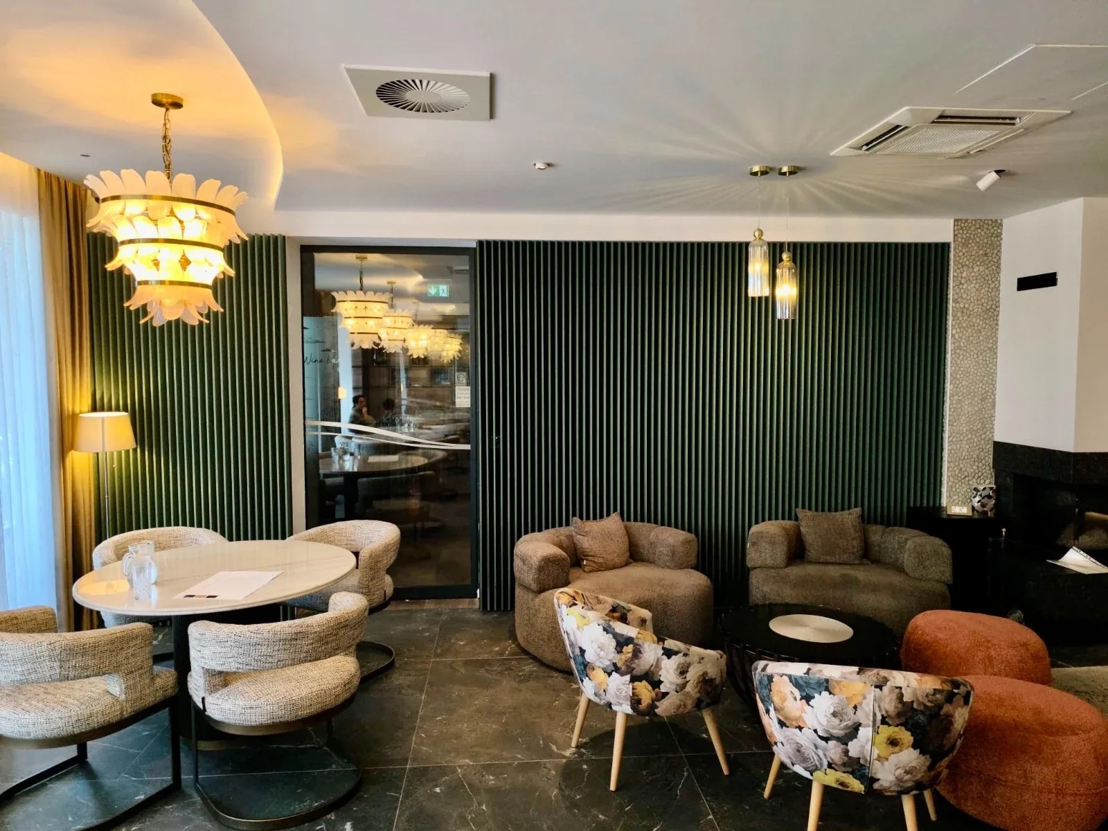
At Hotel Panorama in Prelog, green appears on the reception lamellas and on a large wall surface in the lounge. In the photos of the finished project, this tone reads together with light upholstered furniture, curtains and a darker floor. Repeating the colour connects parts of the hotel that serve different purposes, while the vertical lines give the flat cladding depth.
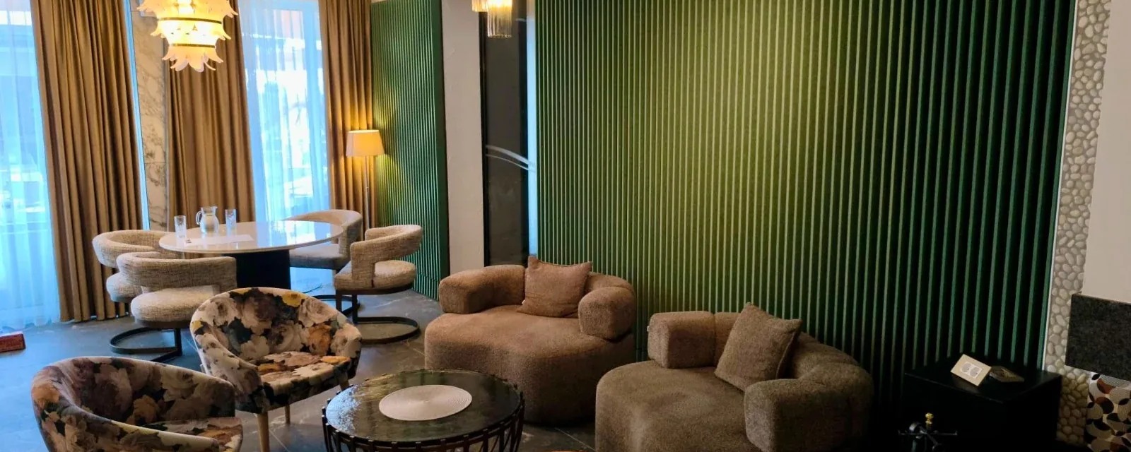
It is a useful design lesson: not every element has to be identical for a space to feel coherent. Sometimes it is enough to carry one colour or one line direction from one point to another. Colour then becomes a point of orientation rather than decoration added at the end.
Before making a final decision, it is worth looking at a physical sample at the installation site, during the day and under the lighting that will actually remain there. A visualisation sets the direction, but the real material in real light makes the decision.
Rhythm shows on the wall and in the space between elements
Repeating the same module creates order. Changing the spacing, direction or size can guide the eye and mark the transition from one zone to another. With PET felt, geometry does not end at the line we see on the panel: the edge, the shadow and the gaps between elements matter too.
This is clearly visible in our project in Stuttgart. Dark ceiling elements create a clear rhythm overhead, while a geometric divider repeats a shape with openings through which the view continues. Up close, you see the pattern; from a distance, the divider reads as one larger volume. It defines a zone, while the space keeps its light and visual connection.
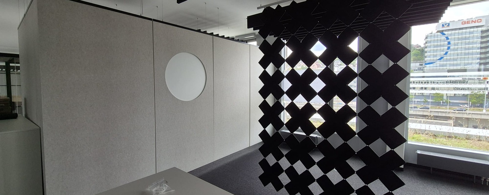
This kind of relationship cannot be judged from a flat panel drawing alone. The element needs to be seen from the perspective of someone sitting, someone entering and someone walking past it. Will the pattern read as calm or very dense? Will the divider frame the view or block it? Sometimes shifting a few modules changes the experience of the whole space.
The ceiling shapes the path through the interior
We usually glance at the ceiling in passing, yet we constantly feel it in the scale of a space. A series of lines can emphasise the direction of movement; a larger whole can mark a place where we linger. When lighting becomes part of the composition, the ceiling takes on another role: it guides the eye and sets the atmosphere by day and by night.
On Bakačeva Street in Zagreb, we installed a coffered acoustic ceiling with integrated lighting. The repetition of the fields gives the room a clear scale, and the luminaires are part of that grid rather than separate points with no relation to one another. The photo shows why it pays to consider the ceiling together with the walls and lighting as early as the concept stage.
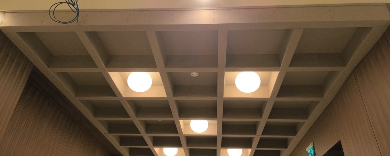
In a space with a different height or purpose, the same layout would not have the same effect. That is why choosing the relationship between form and space matters more than transferring a ready-made pattern from one project to another.
A good element leaves room for other materials
PET felt can sit alongside glass, wood, concrete, metal and upholstered furniture. It does not have to share their texture or colour. What matters more is a clear intention: will it soften the strict geometry of the room, repeat its grid, or introduce a single contrast?
It is especially important to decide where a form ends. How it terminates next to a door, window, building services or the edge of furniture strongly affects the overall impression. A big effect in a visualisation can lose clarity if the real space does not leave enough room for the form to be read. Conversely, simple cladding can look highly considered when its edges, joints and relationship to the existing architecture are well defined.
That said, not every available surface needs to become a feature. Calm areas of a space give stronger elements a reason to stand out. This balance applies to both colour and geometry.
What to send when you want to develop an idea
For an initial conversation with an architect, a short description of the space is more useful than choosing a ready-made model. It is enough to gather:
What to prepare:
-
a floor plan, ceiling height and a few photos taken from the direction people enter;
-
materials and colours that have already been decided;
-
the position of lighting, doors, windows and key building services;
-
areas that should stay visually calm and those that may draw attention;
-
a sketch, a reference or a simple sentence about the impression the space should leave.
With that, it is easier to discuss scale, colour and composition before going into the detailed design of individual elements. The colour palette, 3D and CAD files and photos of completed projects serve as starting material for that conversation.
A space is remembered as a whole
The hotel in Prelog, the office in Stuttgart and the space on Bakačeva Street have different colours, forms and scales. What they share is that the acoustic elements read as part of the interior design: in one place they connect the space through colour, in another they build geometry, and in the third they shape the ceiling and the light.
That is the most exciting moment of working with PET felt. The material offers enough freedom for the solution to start from the character of the interior. When a project has a clear idea, the acoustic element can make it visible.
Have a space in development? Send us a floor plan, a few photos and your idea at office@cloudpro.hr. We will look at which design solution would best belong in that particular interior.